Developing the Campaign Identity
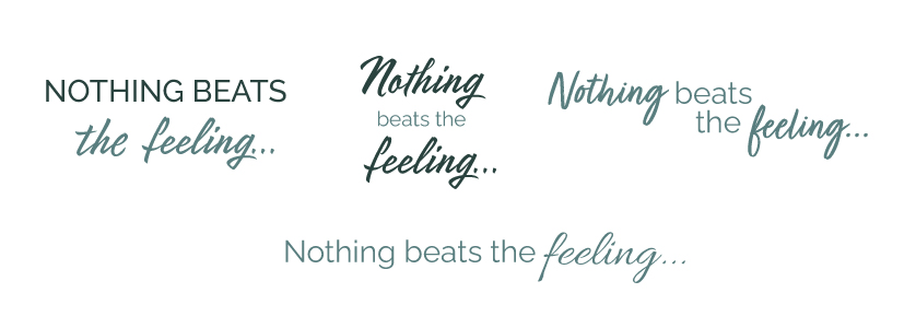
Working alongside the brand team and copywriters, we explored a range of campaign concepts. My next focus was on creating a flexible campaign lock-up that captured the campaign’s emotional message while working effectively across multiple formats.
Designing for Multiple Channels
From the outset, I considered how the lock-up would be applied across print, web and social media. By developing both horizontal and stacked versions early in the process, we avoided later production challenges and ensured consistency as the campaign was rolled out across multiple assets.
Campaign Roll Out
I designed two 30+ page direct mail brochures that introduced the new campaign look and feel. The layouts balanced emotive lifestyle imagery with product information and promotional content, creating a stronger emotional connection while maintaining the commercial objectives of the campaign.
Following delays during the concept phase, production timelines became compressed. Working alongside another designer, I focused on delivering the two main direct mail pieces while ensuring the new campaign identity was applied consistently across all digital assets.
Alongside the main brochures, I adapted the campaign for a series of smaller follow-up mailers, ensuring the visual identity remained consistent across different formats and page sizes.